
Virginia’s Uninsured Population Overview
“A Capstone Project By Ramya Mukara, MSHI, George Mason University”
April 2025
Explore Virginia's uninsured population trends from 2010–2023, focusing on adults aged 0–64.View county-level data for uninsured rates across Virginia, with interactive features that break down information by gender, age, and ethnicity. This page provides interactive features to examine the top 5 counties (lowest uninsured rates) and bottom 5 counties (highest uninsured rates). Analyze the actual population breakdowns by race (Black, White, Hispanic, AIAN, Asian), income (under $25K), education (no high school diploma), poverty, and foreign-born status in the Top 5 and Bottom 5 counties by uninsured rate. Understand how these factors correlate with the uninsured rate among adults aged 19–64.
Number of Virginia’s Uninsured Falls Once More 📉
- From 2010 to 2023, Virginia saw a significant decline in both the uninsured rate and the number of uninsured residents aged 0–64.
- In 2010, the uninsured rate stood at 17.06%, with over 1 million Virginians lacking health coverage.
- The steepest drop occurred between 2013 and 2015, coinciding with the rollout of the Affordable Care Act (ACA) and the launch of the insurance marketplace.
- By 2023, the uninsured rate declined to 7.56%, and the uninsured number dropped to approximately 531,000—nearly a 50% reduction since 2010.
- Despite progress, over half a million Virginians under 65 remain uninsured, highlighting the continued need for policy and outreach efforts.


Source: U.S. Census Bureau's American Community Survey – 5-Year Estimates (Table S2701, 2023) , AIAN - American Indian and Alaska Native
This interactive map shows how the uninsured population is distributed across Virginia’s counties. Darker shades represent counties with higher uninsured percentages, highlighting areas with greater coverage gaps.
When you hover over any county on the map, you’ll see a detailed demographic breakdown below:
- Gender: Number of uninsured males vs. females
- Age: Uninsured residents grouped into <19, 19–64, and 65+ years
- Ethnicity: Uninsured counts by major racial and ethnic groups
For example, hovering over Fairfax County reveals that males account for a higher share of the uninsured, and residents aged 19–64 make up the largest uninsured group. Among racial/ethnic groups, Hispanic residents have the highest uninsured count. This dashboard helps identify not just where uninsurance is most concentrated — but also who is most affected in each locality.
Overview
In Virginia, insurance coverage is not evenly distributed across counties. To understand what differentiates counties with high vs. low uninsured, we compared the population characteristics of the 5 counties with the highest and 5 counties with the lowest uninsured rates.
Rather than analyzing just the uninsured individuals, this analysis focuses on the overall population makeup of these counties — including race, ethnicity, income, education, and other factors known to influence access to health coverage.
📍 Counties Compared in This Analysis
🔽 Bottom 5 Counties (Highest Uninsured Rates)
These counties had the highest percentage of uninsured residents in Virginia:
| County | % Uninsured |
|---|---|
| Manassas Park City | 21.50% |
| Manassas City | 20.10% |
| Winchester City | 11.40% |
| Bristol City | 11.20% |
| Culpeper County | 11.10% |
Top 5 Counties (Lowest Uninsured Rates)
These counties had the lowest percentage of uninsured residents:
| County | % Uninsured |
|---|---|
| Craig County | 2.80% |
| Bland County | 2.70% |
| Goochland County | 2.40% |
| Lexington City | 2.10% |
| Falls Church City | 1.40% |
What We Did
We compared the demographic and socioeconomic makeup of these two county groups. The values shown in the charts reflect percentages of the total county population. This helps us understand the broader conditions that exist in areas with very high or low coverage levels.
Hispanic's Share Is Over 6× Higher in Bottom 5 Counties (25% vs. 4%)

This visualization compares the racial and ethnic composition of the top 5 and bottom 5 counties by uninsured rate. Each percentage reflects the share of that group within the total county population.
What the data shows:
- Bottom 5 counties have a lower percentage of White residents (63%), compared to 85% in the top 5.
- Hispanic residents make up over 25% of the population in the bottom 5 — versus just 4% in the top 5 counties.
- Shares of Black, Asian, and American Indian populations are also slightly higher in high-uninsured counties, but the most significant difference is among Hispanic populations.
This contrast suggests that counties with greater racial and ethnic diversity — particularly higher Hispanic representation — are more likely to experience higher uninsurance. Factors such as language access, employment in jobs without benefits, or immigration status may contribute to this divide.
Higher Poverty, Less Education, and More Foreign-Born Residents in High-Uninsured Counties

Findings:
- Foreign-born residents make up 18.4% of the population in bottom 5 counties — over three times the 5.5% in top 5 counties.
- The percentage of adults without a high school diploma is more than double in high-uninsured counties (9.8% vs. 4.5%).
- Poverty rates are higher in bottom 5 counties (11.5% vs. 8.5%).
- A larger share of residents earn less than $25,000 annually in high-uninsured counties (8.9% vs. 7.3%).
- Unemployment is also higher in bottom 5 counties (18.1% vs. 12.7%).
Together, these indicators point to clear structural differences. Counties with higher uninsured rates tend to have greater economic hardship, lower educational attainment, and more foreign-born residents. These conditions often limit access to employer-sponsored insurance or affordable care options.
Overview
This analysis explores how the percentage of uninsured adults aged 19–64 across Virginia counties is statistically related to various subgroup characteristics—specifically education levels, income brackets, employment status, and poverty levels. While many factors may influence health insurance coverage, our focus was to understand which of these common categories most strongly correlate with uninsured rates in this working-age population. These insights help highlight patterns that can guide more targeted strategies and deeper exploration moving forward.
Why We Focused on Ages 19–64
Adults aged 19–64 make up the majority of Virginia’s workforce and are often responsible for securing their own health coverage. Unlike children or seniors who may qualify for public programs by age, this group faces varying access depending on employment, income, and policy—making them a critical population for understanding insurance disparities.
Data and Approach
We used data from the 2023 five-year American Community Survey (Table S2701) to explore patterns across Virginia counties. This dataset includes insurance coverage breakdowns by age, education, income, employment, and poverty.
Correlation Heatmap:
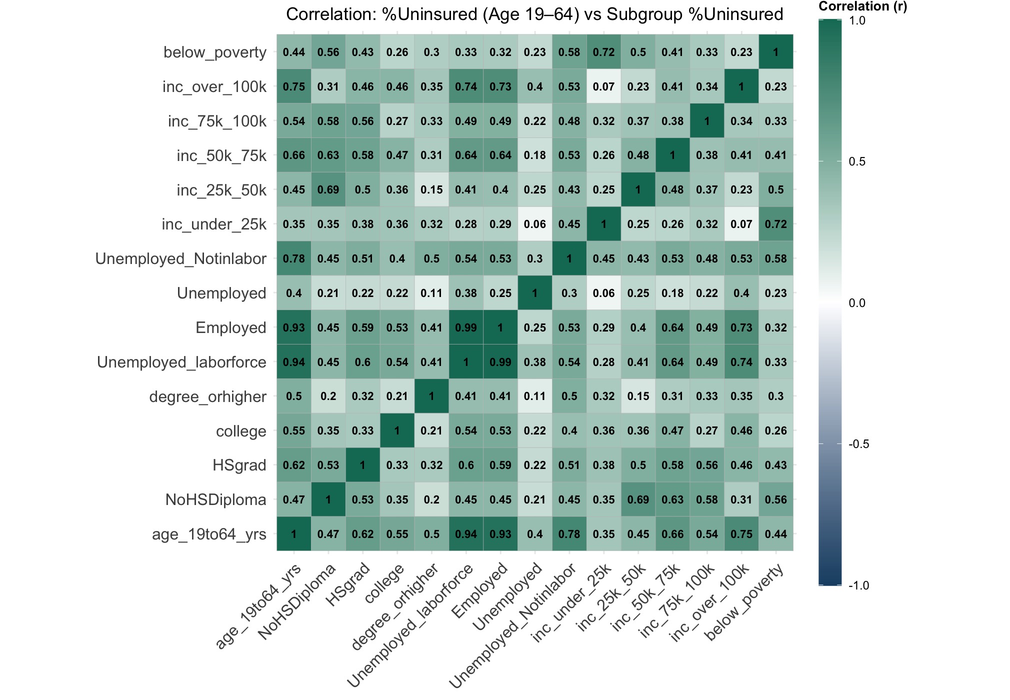
How to Read the Heatmap
Correlation values range from -1 to +1, where:
- +1 means a perfect positive relationship (both values rise together)
- 0 means no relationship
- -1 means a perfect negative relationship (one value rises as the other falls)
In this analysis, we focused on positive correlations to identify which characteristics are more common in counties with higher uninsured rates among adults aged 19–64.
Results
The analysis revealed clear relationships between adult uninsured rates (ages 19–64) and specific characteristics across counties:
- Employment status stood out the most: Counties with more uninsured unemployed adults, and even uninsured employed adults, showed the strongest correlations with overall uninsured rates.
- Education also played a role: Higher uninsured rates were seen in counties where more adults had only a high school diploma or no diploma at all.
- Income-related trends were mixed: Counties with more uninsured individuals in mid-income ($50K–$75K) and even high-income (over $100K) brackets showed positive correlations, suggesting complexity in how income relates to coverage.
- Poverty was moderately linked: Counties with more uninsured adults below the poverty line tended to have higher uninsured rates, though the relationship was less strong than for employment.
These observations highlight that employment and education are closely aligned with where uninsured adults are most concentrated—though insurance gaps also appear in unexpected income groups.
What This Tells Us
- Counties with more uninsured unemployed adults also had the highest overall uninsured rates.
- Even uninsured employed adults showed a strong connection to higher county uninsured rates.
- Counties with more uninsured adults holding only a high school diploma or no diploma had higher uninsured rates.
- Mid- and high-income brackets (like $50K–$75K and $100K+) also correlated with being uninsured, showing insurance gaps exist even in wealthier areas.
- Poverty showed a moderate link—counties with more uninsured people below the poverty line tended to have higher uninsured rates.
👉 These findings help spotlight where insurance gaps are more likely, especially among people with less stable employment or lower educational attainment.
Correlation Analysis Approach
To understand what most closely aligns with the % uninsured among adults aged 19–64, we performed a Pearson correlation analysis. This method helps identify how strongly variables move together, making it a useful tool for comparing relationships between the overall uninsured rate and subgroup patterns.